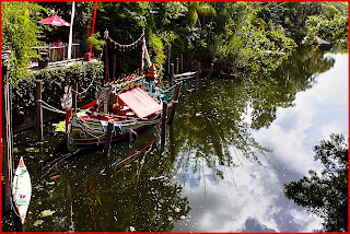
This weeks fabulous image we get to edit is from Marilyn of 'The Artsygirl Connection' and was taken at Disneys Animal Kingdom last year. Head on over to Marilyns fab blog to check out her other awesome Disney images alongside a fabulous crafty section and an inspirational causes/projects section where Marilyn talks of and of course photographs the projects she has created to raise awareness for good causes. Seriously, you guys need to check it out - but not till you get to the end of this page obviously! lol.
So here is the SOOC
Here's my edit
You honestly would not believe the palaver I had with this one. A fab image to begin with and I just couldn't get the effect I was wanting (not that I actually knew what that was, but I would when I got it).
Initially I wanted to clone out those holidaymakers who draw the eye but try as I might I just couldn't get it perfect enough.
So I then decided to do a tight crop instead to crop em out but I wasn't happy with that either.
So here's what I did:
- Opened in CS5.
- Cropped the image.
- Opened HDR and toggled a bit.
- Used 'coffeeshop' sharpen action.
- Opened curves and messed.
- Opened variations and messed.
- Created an extra 15 pixels of Red canvas.
- Screamed because it's still not what I want.
As usual I want to thank the EditMe team for hosting this challenge, myself and many others enjoy this weekly challenge immensly and always look forward to the next image.
So if you guys want to check out the challenge click 'here', you never know you may even find yourself joining in.
Thanks for stopping by and staying long enough to read this.


7 comments:
First off, I love that you "opened up curves and messed". :) The red border is awesome! It totally makes all of the red in the photo pop! I know what it's like to not to get the effect you're going for. Happens to me everyday. This is awesome, though!
Great colors in your edit. Very clear and pretty.
I love how crisp this edit looks the colors are popping in the perfect way.
I absoulutely LOVE your post.. I can't express enough THANKS for that awesome intro. You are AMAZING for that, THANKS SO MUCH :)) Officially your newest happy follower.. I LOVE the red border on your edit, the newer clarity, and the curves.. So unique and awesome.. Very cool techniques.. Thanks so much for sharing your processing.. I just learned a new trick ; ))) I sincerely look forward to reading and indulging in more of your future posts.. :)) Wishing you an amazing rest of week..
LOVE your fabulous tips, I'm taking notes! Such a crisp, clear, beautiful edit!
Really like how you made the colors "pop"! Great edit!
Wonderful edit! It is bold and sharp!
Post a Comment